Delivery fees usually fail because they feel surprising
Restaurant owners sometimes treat delivery fees like something they need to hide until the last possible moment.
That usually backfires.
Most customers understand that delivery costs money. What makes them abandon the order is not the existence of a fee by itself. It is the feeling that the website was vague, the total changed too late, or the ordering path made them do math while they were already trying to check out.
If a restaurant wants more direct orders, the job is not to pretend delivery is free. The job is to explain the delivery deal clearly enough that a customer can decide fast.
That means the website should answer the basic questions before the customer builds a full cart:
- Do you deliver to me?
- How much does delivery cost?
- Do I still need to tip a driver?
- Is there a threshold where the fee changes?
- Is pickup a simpler option right now?
If those answers are missing, the customer starts feeling friction before the food is even involved.
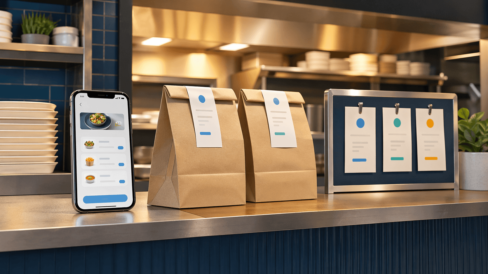
Put the fee explanation before checkout
The most important delivery copy usually belongs earlier than restaurant owners think.
Do not wait until the last screen to reveal the rules. Put the basics where customers are already deciding whether to order:
- near the main order button;
- on the menu or ordering landing page;
- near the delivery and pickup toggle;
- and in a short FAQ or note before the cart gets deep.
This does not need to become a legal document. Plain language is usually better:
- "Delivery available within 5 miles."
- "Flat delivery fee shown before checkout."
- "Pickup is available all day if you want to skip the fee."
Clear copy reduces the wrong expectations early. That is much better than winning a click into the cart and losing the order when the total finally looks different than the customer imagined.
If a restaurant is still getting the pickup side right first, that is a healthy sequence. The same logic from how restaurants should set up pickup orders before adding delivery applies here too: the clearer the foundation is, the easier delivery is to explain.
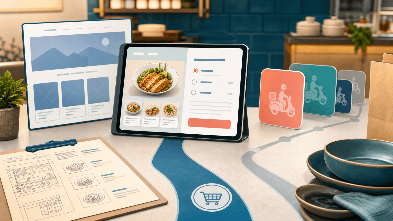
Match the fee language to the real delivery model
Delivery copy only works when it matches how the restaurant actually operates.
A vague promise like "delivery available" is not enough if the real rules are more specific. The website should reflect the actual model:
- flat fee inside a clear radius;
- different fees by zone;
- partial restaurant subsidy above a certain order size;
- limited delivery hours;
- or delivery available only in supported regions.
The customer does not need every operational detail. They do need the decision-making detail.
For example, if the restaurant covers part of the delivery cost on larger orders, say that directly instead of hoping customers discover it later. If delivery is only offered within a five-mile area, say that near the action path instead of burying it in a footer. If pickup is usually faster, say that too.
The clearer the rules are, the less the restaurant has to clean up by phone after the order is already in motion.
Subsidies should feel intentional, not confusing
A delivery subsidy can help direct ordering, but only if the website explains it in one pass.
Many restaurants create accidental confusion by mixing promotional language, tiny disclaimers, and inconsistent thresholds. Customers should not have to compare three screens to understand whether the restaurant is helping with delivery cost.
A better pattern is simple:
- State the base delivery cost.
- State when the restaurant covers part of it.
- State what the customer pays after that.
For example, a restaurant might explain that delivery is normally $10, but orders over $25 get $5 off delivery, so the customer pays $5 instead. That kind of message is easy to picture and easy to market.
What hurts trust is fuzzier copy like "discounted delivery may apply" or "fees vary" with no useful explanation. If the restaurant knows the rule, the website should tell the rule.
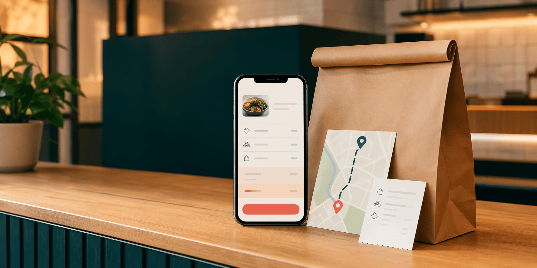
Tipless delivery needs a very clear sentence
This is one reason OmNom can be useful for restaurants that want a cleaner direct-ordering pitch.
OmNom is Blue Penguin's zero-commission restaurant ordering software with zero extra monthly platform fees. In supported regions, it can also support Tipless Delivery. That matters because the restaurant can explain the delivery model in a simpler way: the customer does not tip the driver, drivers are paid $10 per order, and the restaurant can choose whether to cover part of the delivery fee at chosen order thresholds.
That is different from the usual delivery expectation, so the website should not assume customers will automatically understand it.
A strong explanation is short and direct:
- delivery is available in supported areas;
- the delivery fee is shown clearly;
- no driver tip is required;
- and any restaurant subsidy is explained before checkout.
That is much easier to trust than a checkout flow that surprises the customer with an unfamiliar fee structure and expects them to figure it out alone.
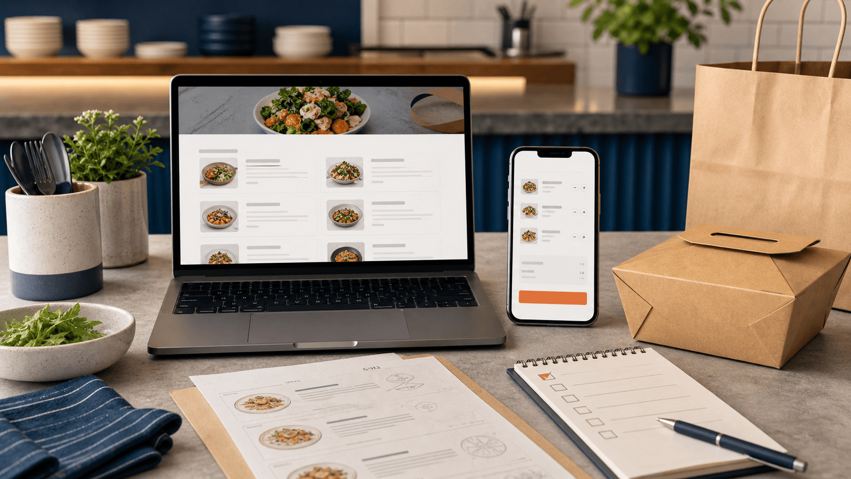
The website, cart, and confirmation page should all say the same thing
A lot of delivery confusion happens because the marketing copy says one thing and the ordering flow says another.
For example:
- the homepage says "delivery available" but the cart reveals a small radius;
- the menu page implies one fee but checkout calculates another;
- or the confirmation page still leaves the customer unsure whether they were supposed to tip.
Consistency matters more than cleverness here.
The restaurant website should carry the same basic delivery message across the pages where customers make decisions. That usually means the homepage, menu or order page, cart, and confirmation screen should all reinforce the same rules instead of introducing a new version each time.
That is also why restaurant website design and ordering setup should be treated as one system. The public site shapes the expectation, and the ordering flow either confirms it or breaks it. The websites for restaurants page is a good example of the kind of site structure that should support that path clearly.
Clearer fee messaging protects direct ordering
Restaurants do not need delivery copy that sounds clever. They need delivery copy that helps a hungry customer make a quick, confident decision.
That usually means:
- showing the delivery radius before checkout;
- stating the fee in plain language;
- explaining whether tip is part of the model;
- making any subsidy easy to understand;
- and keeping pickup visible as the simpler fallback when it makes sense.
When the fee explanation is clean, direct ordering becomes easier to defend. The customer sees the tradeoff, understands the convenience, and can choose without feeling tricked.
That is the kind of practical system work Blue Penguin is built for: the restaurant website, the order path, and the surrounding delivery messaging all working together instead of fighting each other.
If your restaurant needs a cleaner direct-ordering experience, start with Blue Penguin's get started flow. If you want to tighten the rest of the restaurant website first, read a restaurant website checklist for more direct orders.