Catering and everyday ordering are different jobs
Restaurants sometimes try to handle everything with one giant "Order Online" path.
That feels simple from the owner's side, but it usually creates confusion for the customer.
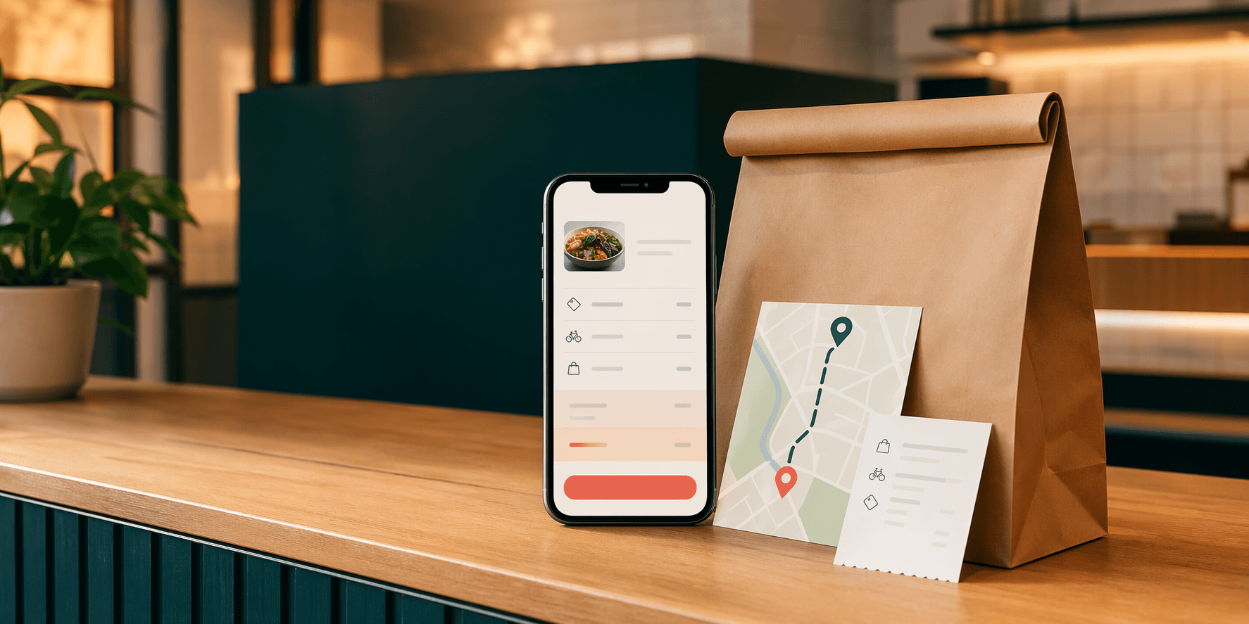
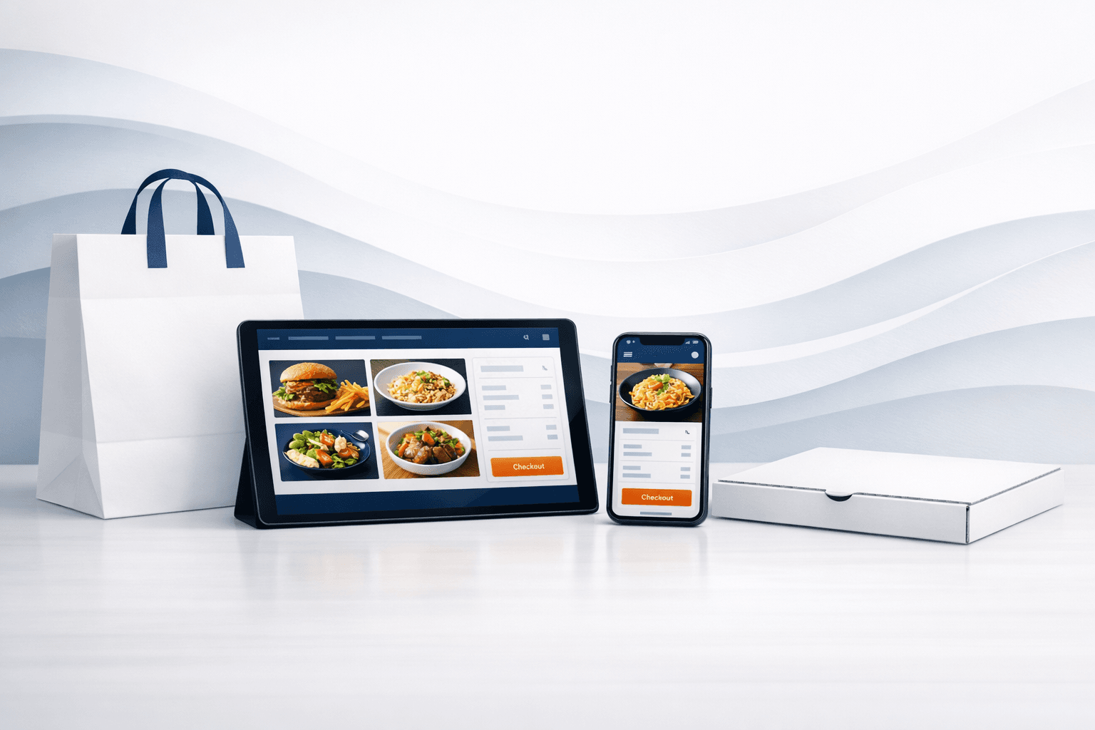
An everyday online order is about speed. The customer wants to see the menu, choose food, check out, and move on.
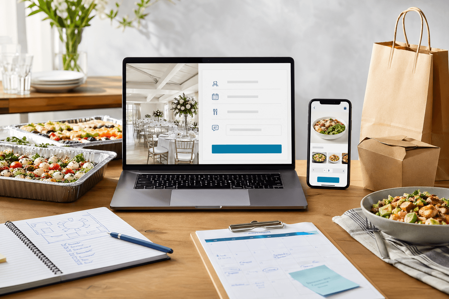
A catering inquiry is different. The customer may need:
- a delivery or pickup date;
- headcount;
- budget expectations;
- setup or service details;
- dietary notes;
- and confirmation that the restaurant can handle the event at all.
That is not the same buying moment.
When the website pushes both audiences through the same path, the restaurant often ends up with the wrong kind of lead on both sides. Regular customers get distracted by extra decision-making, and catering customers still need a follow-up conversation because the order flow did not ask the right questions.
A separate catering page improves conversion, not just organization
Some owners worry that a dedicated catering page adds one more thing to maintain.
In practice, it usually makes the website easier to understand.
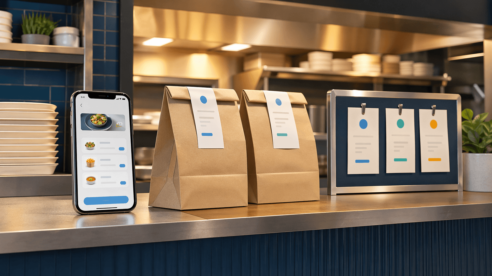
The main ordering path can stay fast:
- view the menu;
- choose pickup or delivery;
- place the order;
- and check out on a phone without friction.
The catering path can do a different job:
- explain what kinds of events the restaurant handles;
- describe how far ahead people should reach out;
- set expectations for group size or minimums when relevant;
- and collect the details needed for a real quote or follow-up.
That separation helps the restaurant sell both services better because each path matches the actual customer intent.
This is the same reason a strong restaurant website should not treat every visitor like they came for the exact same action. The website needs to support the fast order and the higher-consideration inquiry without making either path feel awkward.
Catering should have its own page because the search intent is different
A separate catering page is also useful for local visibility.
Someone searching for lunch today is not searching the same way as an office manager planning food for thirty people next week. The catering buyer is more likely to look for phrases tied to events, group size, office lunches, private parties, or specific catering service in the local market.
That means the restaurant website should give catering its own crawlable space instead of hiding it behind a generic line in the header or a tiny note on the menu page.
A dedicated page makes it easier to explain:
- what kinds of catering the restaurant offers;
- what neighborhoods or service areas it realistically serves;
- how far in advance customers should ask;
- whether pickup, delivery, or setup is available;
- and how the restaurant wants inquiries to begin.
That is better for search visibility because the page can answer a real question clearly. It is better for conversion because the customer lands on a page that matches the reason they searched in the first place.
Do not make catering customers use the regular cart unless the workflow truly fits
There are restaurants where catering can work as a straightforward online order.
If the offering is tightly packaged, the quantities are standardized, and the timing rules are simple, then a structured ordering path can make sense.
But many restaurants use the word "catering" to describe something much more custom:
- trays with variable quantities;
- office lunches with timing constraints;
- private events with service questions;
- venue-specific setup needs;
- menu adjustments for dietary restrictions;
- or large orders that still need staff review before confirmation.
That kind of request usually belongs in a dedicated inquiry flow, not the same experience as someone ordering dinner from their couch.
Trying to force a more custom catering request through the normal cart often creates the exact problems restaurants want to avoid:
- incomplete details;
- back-and-forth after checkout;
- orders that need manual correction;
- and customers who assume something is confirmed before the restaurant has reviewed it.
If the restaurant still needs a conversation, the website should admit that and make the inquiry path feel organized instead of pretending the process is instant.
What the catering page should collect before the callback
The best catering page does not ask for everything. It asks for the information that makes the next step easier.
That usually includes:
- event date and time;
- estimated guest count;
- delivery, pickup, or setup preference;
- location or ZIP code when service area matters;
- a short description of the event;
- and clear contact details.
Some restaurants may also want budget range, menu preference, or notes about dietary needs. The right fields depend on how the team actually scopes catering work.
The goal is not to turn the page into paperwork. The goal is to stop the restaurant from having to ask the same basic questions by email every single time.
This is the same operational logic behind when a contact form is not enough for a small business website. Better intake is not about adding random friction. It is about collecting the minimum useful detail so the follow-up can be fast and confident.
Keep the catering call to action visible, but do not let it compete with the main order button
Restaurants often make one of two mistakes:
- Catering is buried so deeply that serious buyers have to call just to figure out whether it exists.
- Catering is promoted so aggressively that the core ordering path starts feeling less clear.
The fix is usually simple.
Keep direct ordering prominent for the everyday customer, and keep catering easy to find for the planned purchase.
That can mean:
- a clear "Catering" link in the main navigation;
- a short catering section on the homepage;
- a dedicated catering page with its own inquiry form;
- and a menu or footer mention that reinforces the option without hijacking the main order flow.
This is especially important on mobile. A hungry customer should not have to sort through event-planning copy before they can order lunch. A catering buyer should not have to guess whether the restaurant can handle a larger job.
The site can support both as long as it treats them as separate decisions.
The workflow may need to grow after the page starts working
For some restaurants, a dedicated catering page is enough.
For others, it is only the first step.
If the restaurant starts getting steady catering volume, the next pain points usually appear behind the form:
- staff quoting the same packages over and over;
- deposit collection happening manually;
- event details getting buried in inbox threads;
- and owners needing a cleaner handoff from inquiry to confirmation.
That is where the website can grow into a more structured system.
Blue Penguin is useful for that progression because the work does not have to stop at a public page. The same site can support better intake now, then grow into software or payment-supported workflow if the catering process keeps repeating. For straightforward deposits or event holds, Blue Penguin can also connect a simple Stripe payment step when that fits the process.
Regular direct ordering still deserves its own clean lane too. That is where OmNom fits naturally for restaurants that want a stronger direct-ordering path without turning every food purchase into a catering-style inquiry.
Separate paths make the restaurant easier to buy from
Restaurants do not need a more complicated website. They need a website that respects the difference between fast ordering and planned event buying.
That usually means:
- direct ordering stays quick;
- catering gets its own page and inquiry flow;
- search intent has a page that can actually rank and convert;
- and the team gets better information before the callback.
That is a practical improvement, not just a design preference.
If your restaurant needs a site that supports both direct orders and better catering leads, start with Blue Penguin's get started flow. If you want to tighten the rest of the direct-order path too, read a restaurant website checklist for more direct orders.