The button is a business decision
A small business website should make the next step feel obvious.
That sounds simple until the homepage starts collecting buttons: call now, request a quote, book online, view services, order now, email us, follow us, download a menu, join a list, and read more. Each button may be reasonable on its own. Together, they can make the page feel uncertain.
The problem is not the button design. It is the decision behind the button.
The primary call to action should match the way a real customer is most likely to move forward. A plumber may need a quote request. A salon may need online scheduling. A restaurant may need ordering. A consultant may need a discovery call. A contractor may need photos, location details, and job timing before anything else can happen.
Choosing that main action early makes the rest of the website calmer. The homepage, navigation, service pages, contact form, and follow-up process can all support the same direction instead of competing with each other.
Start with the customer's buying stage
The right call to action depends on how ready the visitor usually is.
Some customers are ready to act immediately. They need a table, appointment, order, emergency service, or payment step. For those visitors, the primary action should be direct. "Book online," "Order now," "Request service," or "Start your quote" can make sense because the customer already knows what they want.
Other customers need more context before they act. They may be comparing providers, learning whether the service fits their situation, or trying to understand scope and price. For those visitors, a hard "buy now" button can feel premature.
A good call to action should not force every visitor into the most aggressive step. It should invite the next reasonable step.
Ask:
- Does the customer usually know exactly what they need?
- Does the business need to qualify the request first?
- Is pricing fixed, estimated, or custom?
- Is the action urgent, scheduled, or consultative?
- Would a customer feel comfortable completing this action on a phone?
Those answers matter more than what looks good in a template.
Match the action to the operation behind it
A website button creates work somewhere else.
If the homepage says "Book now," the business needs a real booking flow behind it. If it says "Request a quote," someone needs to review the details and respond. If it says "Order online," the menu, availability, payment, pickup, and delivery rules need to be reliable. If it says "Start a project," the follow-up process needs to make the next step clear.
This is where many websites quietly break down. The public page promises a clean action, but the internal process is still vague.
Before choosing the primary call to action, the owner should know what happens after the click:
- what information the customer gives;
- who receives it;
- how quickly someone responds;
- what counts as a complete request;
- whether the customer gets confirmation;
- and what the team does next.
The best button is not always the shortest path to a sale. It is the clearest path the business can actually support.
That is why a quote form, booking tool, ordering system, payment link, or customer portal should be chosen based on the workflow, not just the homepage layout.
Do not make every action equal
Secondary actions are useful. They just should not compete with the main one.
A homepage might need a primary button for "Request a quote" and a secondary link for "View services." A restaurant might need "Order online" first and "Ask about catering" second. A consultant might need "Schedule a call" first and "See how it works" second.
The visitor should be able to scan the page and understand which action matters most.
When every button uses the same weight, color, size, and placement, the website asks the visitor to do the strategy work. That is not helpful. Most visitors are moving quickly, especially on mobile. They are comparing options, checking service fit, and deciding whether the business feels trustworthy enough to contact.
The primary action should be visually stronger. Secondary actions can still be present, but they should feel like supporting paths.
This also helps the business measure the site more honestly. If the main goal is quote requests, then quote requests should be the clearest conversion. If the main goal is online orders, the order path should not be buried under generic contact options.
Use the homepage for the broadest next step
The homepage usually serves several kinds of visitors at once.
That does not mean it should offer every possible action at the top.
The homepage call to action should usually point to the broadest valuable next step. For a service business, that may be a quote request or service inquiry. For a restaurant, it may be direct ordering. For a local business with appointment-based work, it may be booking. For a more consultative offer, it may be a short intake form or conversation.
Deeper pages can have more specific actions.
A service page can ask for details about that service. A location page can make the service area clear. A catering page can ask for date, headcount, and event details. A software project page can move toward a scoped conversation. A pricing page can explain when the standard offer applies and when a custom quote makes more sense.
This keeps the homepage from becoming a crowded control panel. The homepage gives visitors a clear main path. The deeper pages handle specific intent.
That same thinking shows up in how local businesses should plan service area pages: the homepage should stay broad enough to orient the visitor, while supporting pages do the more detailed work.
Choose different CTAs for different business models
Different businesses need different calls to action because they sell in different ways.
A home service business may want "Request a quote" because the job depends on location, scope, timing, and photos. "Buy now" would not fit most of those visits.
A salon, clinic, trainer, or appointment-based business may want "Book online" if availability and service choices can be handled cleanly.
A restaurant may want "Order online" for everyday meals, while keeping catering and private event inquiries separate. Those are different workflows, even if they both start on the website. For restaurants that need a direct ordering system, OmNom can support zero-commission ordering with zero extra monthly platform fees, while Blue Penguin can support the broader public website around it.
A consultant or custom service provider may want "Start a project" or "Schedule a call" because the sale depends on fit, trust, and scope.
A business that sells more complex software, app, or portal work may need an intake path rather than an instant checkout. The visitor should be able to describe the problem before anyone talks about implementation.
The CTA should reflect the real buying path. A button that sounds impressive but does not match the business model will create worse leads, not better ones.
Know when the CTA needs software behind it
Some calls to action are simple links. Others are the beginning of a system.
A "Call now" button can be simple. A "View services" link can be simple. A basic contact form can be simple.
But "Track my request," "Manage subscription," "Order delivery," "Upload job photos," "Approve quote," or "Book recurring service" may need real software behind the website.
That does not mean the business should overbuild immediately. It means the owner should be honest about where the website ends and the workflow begins.
If the primary call to action creates repeated work, staff assignments, customer statuses, payments, or order rules, the project may be more than a brochure site. It may still start with a clean website, but the next phase could become a portal, dashboard, restaurant ordering flow, or custom app.
When a contact form is not enough for a small business website goes deeper on that boundary. The short version is that a CTA should not promise a process the business cannot actually run.
A simple decision framework
If you are choosing the primary call to action for a small business website, start here:
- Name the most valuable action a good visitor can take.
- Confirm whether the customer is usually ready for that action.
- Decide what information the business needs before responding.
- Make sure someone owns the next step after submission, booking, ordering, or payment.
- Keep the primary button strong and the secondary options quieter.
- Use deeper pages for more specific customer paths.
This is a practical decision, not a branding exercise.
A clear website call to action should reduce confusion for the visitor and reduce manual cleanup for the team. It should help the business receive better inquiries, cleaner bookings, more reliable orders, or more focused project conversations.
Where Blue Penguin fits
Blue Penguin is useful when a business needs the website, the call to action, and the follow-up path planned together.
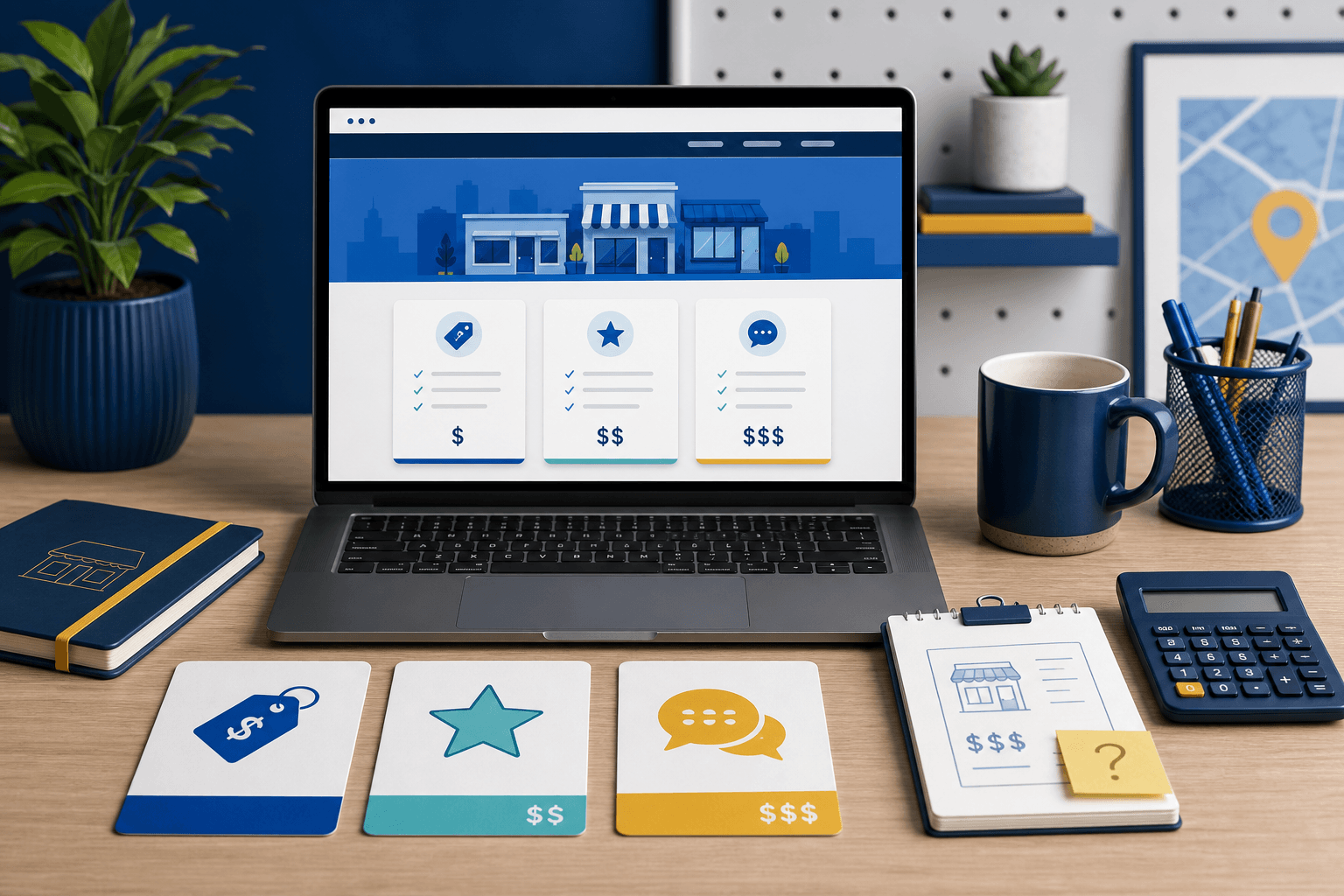
The current offer is straightforward: $420 to launch right now, $20/month after that, and no contracts. Pricing can still be negotiated when the scope genuinely needs deeper software, app, ordering, portal, or payment work.
That matters because the right CTA is often tied to the build itself. A business may start with a simple quote form, then later need a customer portal. A restaurant may need a public website plus OmNom ordering. A service company may need a lead path that can grow into a better follow-up system.
If your website has too many buttons and no clear main action, start with Blue Penguin's get started flow. If the broader concern is whether the site is ready for more traffic, read what to fix on your website before paying for ads.