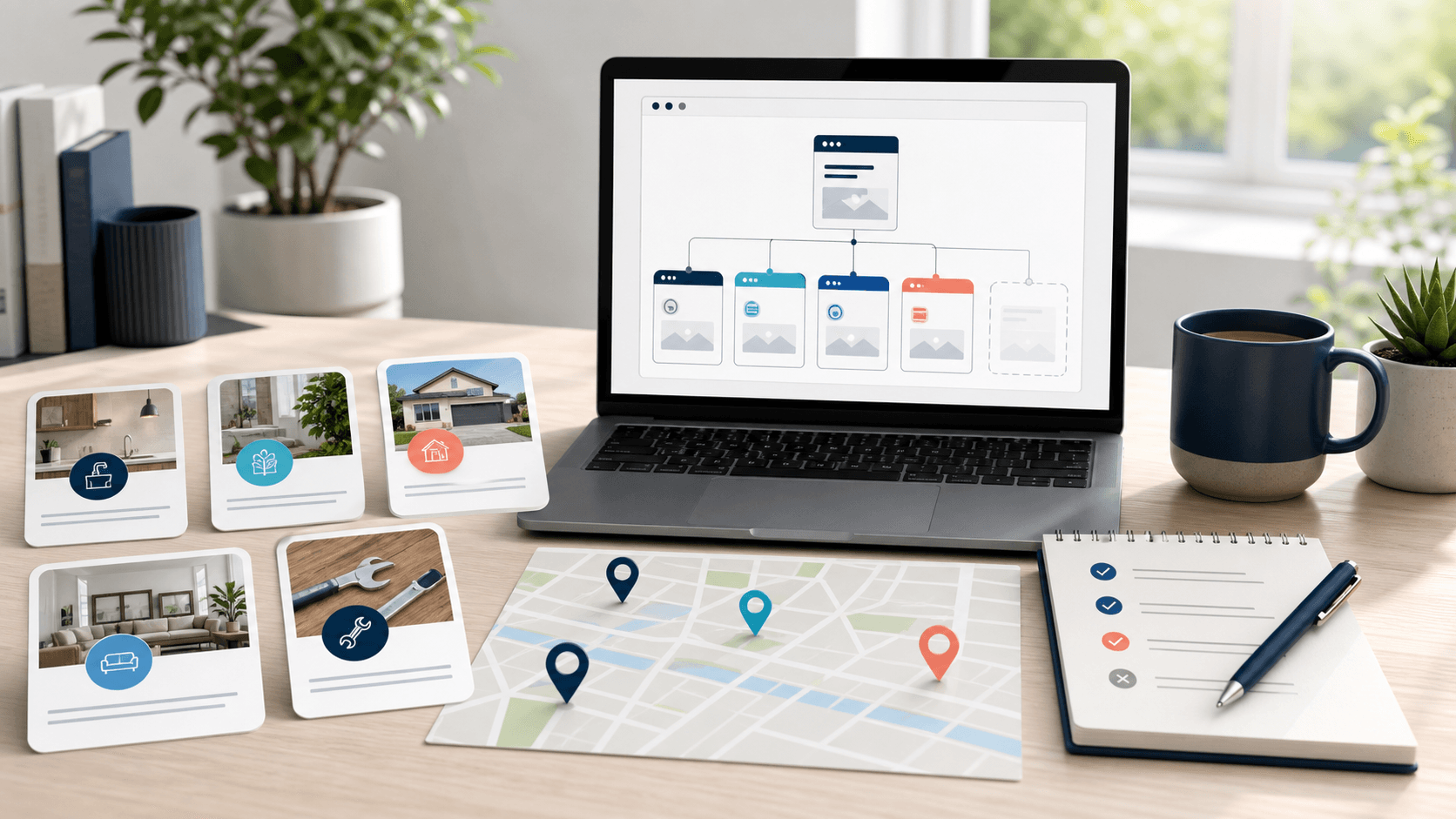
Mobile-first is about the customer's situation
A mobile-first local business website is not just a desktop website squeezed onto a phone.
It has to respect the moment the customer is in.
Someone might be standing in a parking lot comparing restaurants. A homeowner might be searching for an electrician from the couch while something is not working. A parent might be checking a salon's hours between errands. A contractor might be trying to request a quote before getting back in the truck.
Those visitors are not browsing the site like a brochure. They are trying to make a decision with a small screen, limited patience, and a real next step in mind.
That is why mobile-first design is both a conversion issue and a local SEO issue. The website needs to load into a clear answer, show the business is real, and make the next action easy to complete without forcing the visitor to pinch, zoom, hunt, or decode the page.
Put the first useful action near the top
On mobile, the first screen has to earn its keep.
That does not mean cramming every button above the fold. It means the visitor should quickly understand three things:
- what the business does;
- whether it serves their need or location;
- and what they should do next.
For a service business, that next step may be calling, requesting a quote, booking an appointment, or sending photos. For a restaurant, it may be viewing the menu, starting a pickup order, checking delivery options, or asking about catering. For a custom software or app project, it may be describing the workflow that needs help.
The mistake is treating every mobile visitor like they are ready for the same action.
If a plumber has emergency calls and planned installs, those actions may need different labels. If a restaurant has everyday orders and catering inquiries, those paths should not compete in the same tiny button row. If a consultant needs a high-trust conversation, the mobile page should build enough confidence before asking for a call.
The first action should match the business model, not a template.
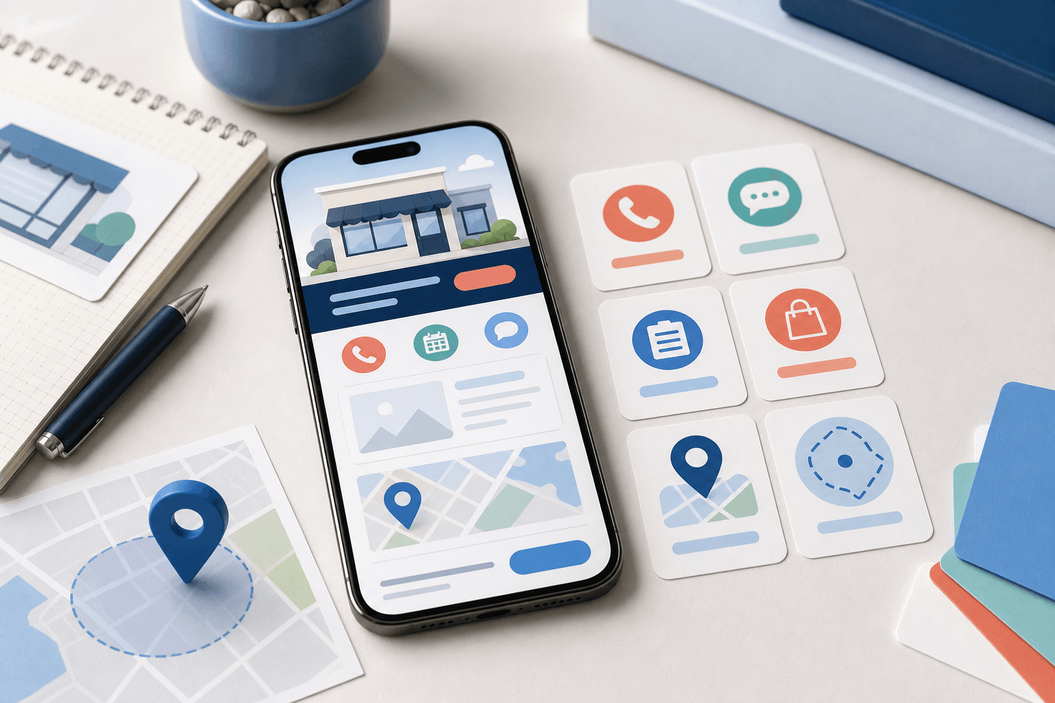
Make tap targets boringly obvious
Mobile visitors should not have to wonder what is clickable.
Buttons need enough space around them. Phone numbers should be tappable. Forms should avoid tiny fields and vague labels. Navigation should be short enough that a real person can use it with one thumb.
This sounds basic, but it is where many local sites quietly lose people.
A page can look polished on a laptop and still be frustrating on a phone if:
- the menu hides important pages;
- the phone number is image text instead of a link;
- the quote button is too close to another control;
- the form asks for too much before the visitor trusts the business;
- service cards are hard to distinguish;
- or the ordering path starts with a confusing choice.
Good mobile design feels calm because the obvious action is actually obvious.
That clarity also helps the business. When customers tap the right action the first time, staff get cleaner calls, quote requests, bookings, orders, and messages.
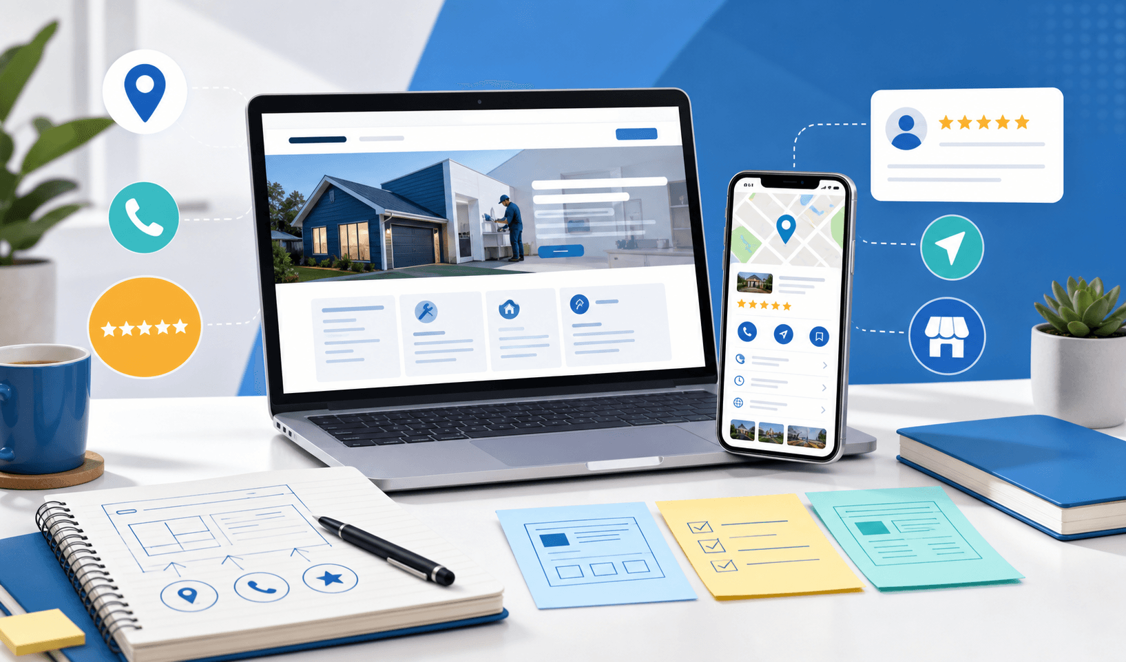
Keep local trust signals easy to scan
Mobile-first does not mean removing proof.
It means putting proof where people can absorb it quickly.
A local customer often wants practical reassurance before they act:
- Does this business work in my area?
- What kinds of jobs, orders, or projects does it handle?
- Are the hours current?
- Is there a real phone number?
- Are photos, reviews, examples, or service details easy to find?
- What happens after I submit the form?
Those details should not be buried under decorative sections.
For local SEO, the same principle applies. The website should use clear service language, real location details, useful internal links, and crawlable copy. A phone-friendly page that says very little is still thin. A keyword-heavy page that is hard to use on mobile is still weak.
The stronger foundation is covered in what local SEO actually needs on a small business website. Mobile-first design should support that foundation by making the most important local details easy to read and act on.
Design forms around the real handoff
Mobile forms deserve special attention because they sit at the point where interest becomes work.
A short form is not automatically better. A long form is not automatically worse. The right form asks for enough information to handle the next step cleanly without making the visitor feel trapped.
For example:
- an emergency service request may need name, phone, address, and problem type;
- a planned quote may need service category, timing, photos, and notes;
- a restaurant catering inquiry may need date, headcount, location, and budget context;
- a mobile app or custom software inquiry may need the workflow, users, and current tools involved.
The mobile version should make those questions feel manageable. Use plain labels. Avoid unnecessary fields. Group related details. Keep the submit action visible. Explain what happens next.
If the team always has to ask the same follow-up questions after a form arrives, the mobile form may be too vague. If visitors keep abandoning the form, it may be asking for details before the page has earned enough trust.
Mobile-first is not only about the screen. It is about the handoff behind the screen.
Watch the restaurant ordering path especially closely
Restaurant websites expose mobile problems faster than almost any other local business category.
A hungry customer is usually trying to answer a narrow question:
- What can I order?
- How much is it?
- Can I pick it up?
- Can I get delivery?
- How long will this take?
- Can I order without calling?
If the menu is a PDF, the order button is hidden, the hours are unclear, or checkout feels disconnected from the website, the customer may not wait around.
A good restaurant website can start with clear mobile menu UX before it becomes full ordering. But when customers are ready to place repeat orders, the mobile path should stop acting like a static menu and start acting like a real ordering flow.
That is where OmNom can fit. OmNom is Blue Penguin's zero-commission restaurant ordering software with zero extra monthly platform fees. The public site should make the restaurant easy to trust; the ordering layer should make the transaction easy to finish.
Know when mobile-first becomes app or software work
Some mobile problems can be solved with better website design.
Others are signs that the business needs software behind the site.
You may be moving beyond a standard mobile website if customers or staff need:
- accounts;
- saved order history;
- recurring payments;
- delivery rules;
- service status updates;
- staff dashboards;
- file uploads and approvals;
- field workflows;
- or different views for owners, employees, and customers.
That does not mean the business needs a mobile app immediately. Many local businesses should improve the mobile website first. But if the repeated mobile action depends on memory, rules, roles, notifications, or status, the project may be custom software, restaurant ordering, or a mobile app instead of only a page redesign.
This is the useful line to draw. Fix the public mobile experience when the customer cannot understand or act. Plan software when the business cannot reliably handle what happens after the customer acts.
A practical mobile-first checklist
Before rebuilding a local business website, test the mobile experience with real tasks:
- Can a new visitor understand the business in a few seconds?
- Can they tap the most important action without scrolling forever?
- Can they call, request a quote, book, order, or ask a question without zooming?
- Can they confirm the business serves their area?
- Can they find hours, pricing context, photos, services, proof, or menu details?
- Can staff act on the form submission without asking for the same missing details every time?
- Does the mobile path still make sense if the visitor is distracted, rushed, or comparing options?
If the answer is no, the site may not need more decoration. It may need a clearer mobile path.
Where Blue Penguin fits
Blue Penguin builds local business websites with the mobile experience treated as part of the business workflow, not as an afterthought.
For website projects booked by May 22, 2026, the current offer is no upfront setup fee, then $20/month after launch. Blue Penguin handles design, development, hosting, domain setup, maintenance updates, and everyday technical work. Custom software, mobile apps, and OmNom-specific systems are still scoped around the real project.
That matters because mobile-first work often starts as design, then quickly touches forms, local SEO, restaurant ordering, payments, staff handoffs, and future software needs.
If your site looks fine on a laptop but customers still struggle to call, quote, book, order, or understand what you offer from a phone, start with Blue Penguin's get started flow. Describe the mobile action that feels hardest right now. That one detail usually reveals whether the next move is a better website, a clearer ordering path, or a deeper workflow.