Start with decisions, not charts
A small business dashboard can look impressive and still be almost useless.
That usually happens when the first screen is designed around data that is easy to display instead of work that actually needs attention. A big chart can show activity, but it may not help anyone decide what to do next.
For many local businesses, the first dashboard should answer a simpler question:
What needs action today?
That might mean a new quote request, an order that is waiting for confirmation, a customer who needs a reply, a job that moved into the next stage, a payment that failed, or a staff note that changed the plan.
The dashboard should make the business easier to run. It should not become another place where information sits quietly until someone remembers to check it.
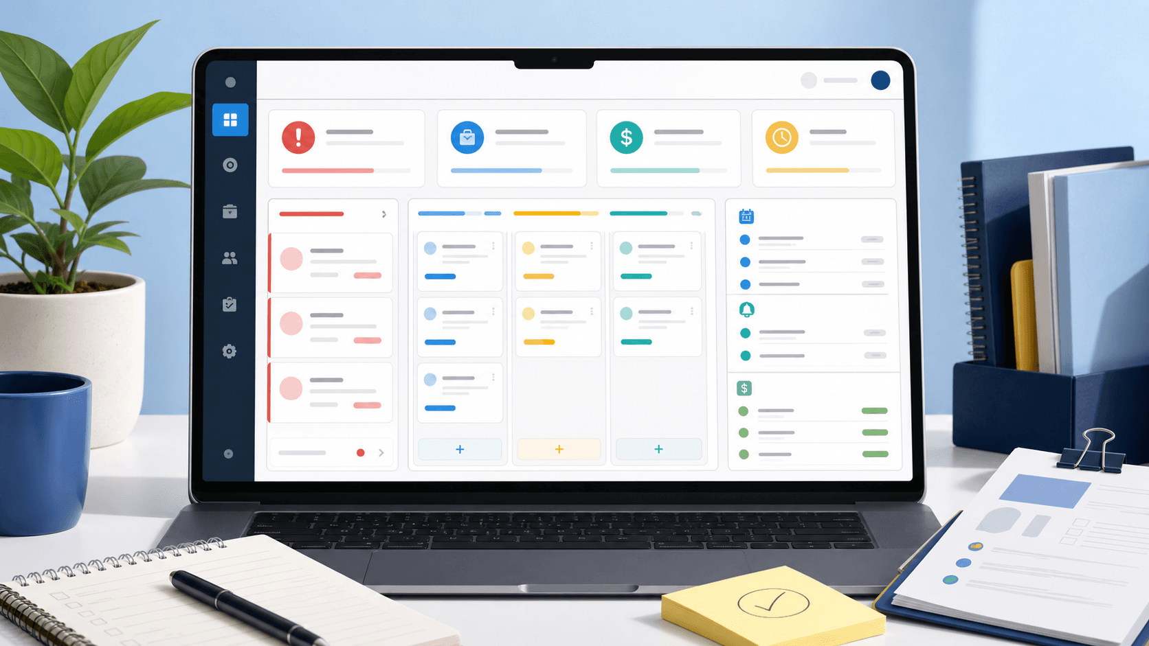
The first screen should show the open loops
The most useful dashboard items are usually open loops.
An open loop is anything that has started but is not finished yet. A form was submitted. A customer asked a question. A restaurant order came in. A deposit was paid. A delivery needs timing. A service request needs a quote. A staff member updated the status but the customer has not been told.
Those are the moments where the business can lose trust if nobody sees the next step.
A strong first screen might show:
- new leads that have not been contacted;
- quote requests waiting on staff review;
- orders that need pickup, delivery, refund, or kitchen action;
- jobs waiting on customer approval;
- payments, deposits, or invoices that need attention;
- follow-ups that are overdue;
- and recent customer messages that are not tied cleanly to an owner.
This is different from a reporting dashboard.
Reporting is useful, but daily operations usually need action lists before trend graphs. If the owner opens the dashboard between appointments, during lunch, or after a job, the first screen should help them protect the day.
Group work by status, not by where it came from
Small businesses often collect work from too many places.
One customer calls. Another fills out a website form. Someone sends a Facebook message. A restaurant gets an online order. A regular customer texts the owner. A team member adds a note to a spreadsheet. The problem is not that any one channel is wrong. The problem is that the business starts sorting work by inbox instead of by status.
A dashboard becomes useful when it translates those channels into a shared workflow.
For example:
- New
- Assigned
- Waiting on customer
- Waiting on staff
- Ready for payment
- Scheduled
- Completed
- Needs review
The exact labels should match the business. A roofing company, salon, restaurant, consultant, and repair shop will not use the same workflow. But the principle holds: the dashboard should make it clear where the work stands, not just where the message arrived.
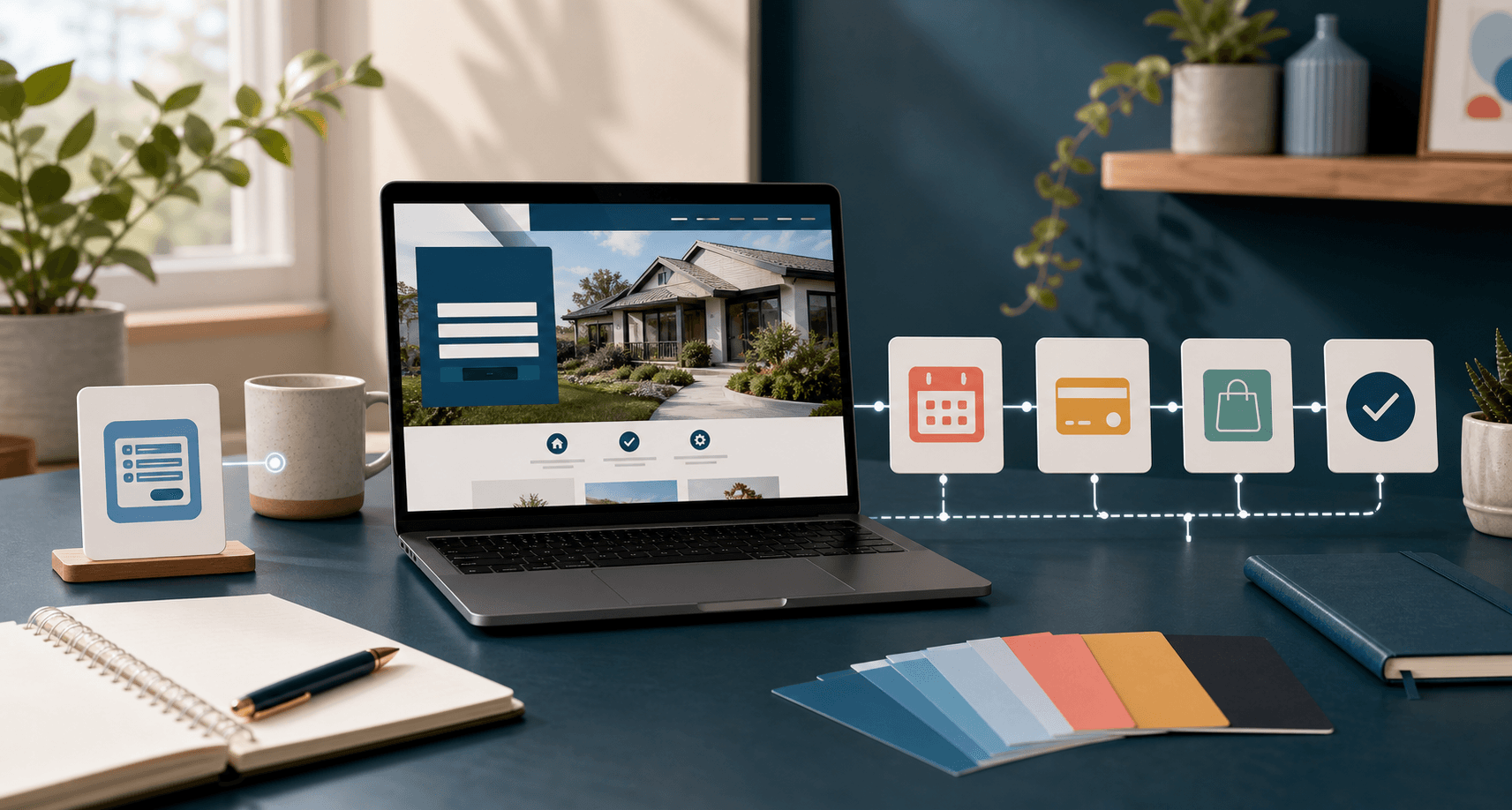
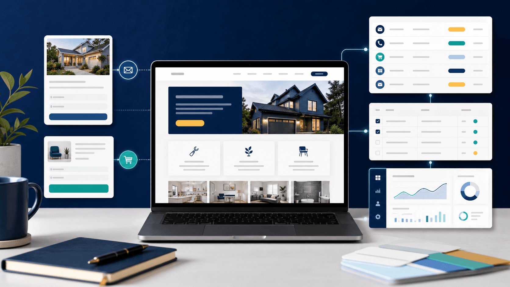
That is why a dashboard often comes after the website begins collecting more structured information. When a small business website needs a database explains that shift: once the site needs to remember records, statuses, orders, payments, or staff notes, the project is moving from a public website into operational software.
Show enough detail to act without opening five tabs
A dashboard card should not hide the one detail staff need to decide what happens next.
If the dashboard says "new lead," but the owner has to click through three screens to see the service, location, budget, phone number, and message, the first screen is not doing enough work. If an order card shows the customer name but not the pickup time, payment state, or item issue, staff will still fall back to the old system.
The best dashboard summaries usually include the small set of details that change the next action:
- customer name and contact method;
- service, order, or request type;
- due date, pickup time, appointment time, or event date;
- current status;
- assigned staff owner, if there is one;
- payment or deposit state when it matters;
- and the last meaningful note or message.
That does not mean every card should become a wall of text. It means the dashboard should respect the speed of the business.
A restaurant order dashboard may need item count, timing, pickup or delivery mode, payment state, and customer note. A contractor lead dashboard may need service type, ZIP code, urgency, photos attached, and whether anyone replied. A recurring service dashboard may need next visit, customer status, and unresolved notes.
The dashboard should carry the details that prevent avoidable follow-up work.
Separate operations from owner reporting
Many dashboard projects get muddy because they try to serve two jobs at once.
The first job is operations: what needs attention right now?
The second job is reporting: how is the business doing over time?
Both matter, but they should not fight for the same first screen.
Operations may need lead queues, order statuses, appointment exceptions, payment issues, delivery notes, and unread messages. Reporting may need monthly revenue, source breakdowns, close rates, order volume, popular services, average response time, or completed jobs.
If the daily dashboard opens with reporting, staff may miss urgent work. If the owner dashboard only shows today's queue, the business may miss longer patterns.
A practical custom dashboard can handle both by separating views:
- Today
- Leads
- Orders or jobs
- Customers
- Messages
- Payments
- Reports
The first tab should match the person using it. A front counter, field team, restaurant manager, and owner may need different starting points. That is a design decision, not just a technical one.
Start with one workflow before adding everything
The safest dashboard scope is usually one repeated workflow.
For a service business, that might be quote requests from the website. For a restaurant, it might be direct pickup orders before adding delivery complexity. For a client-based business, it might be customer requests and status updates. For a subscription business, it might be payments, customer records, and support messages.
Starting with one workflow keeps the project honest.
It forces the team to define:
- What creates the record?
- What statuses can it move through?
- Who owns the next step?
- What does the customer need to know?
- What does staff need to see?
- What should happen automatically?
- What should stay manual?
Those questions matter more than picking a dashboard layout from a template.
If the first workflow works, the dashboard can grow. It can add customer history, payments, delivery logic, admin notes, reminders, staff roles, or a mobile staff view later. But the first version should make one real process easier before it tries to describe the whole business.
For lead-heavy businesses, how to turn website leads into a simple follow-up system is a useful starting point. A dashboard should support that follow-up logic instead of becoming a prettier inbox.
Know when this is beyond a standard website
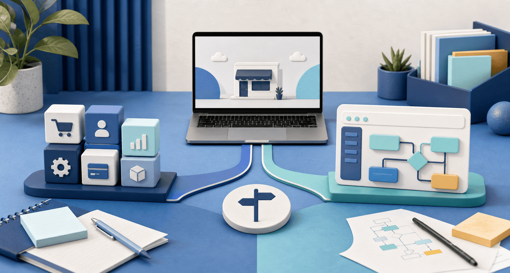
A dashboard is usually custom software, even when it lives inside the same website.
That does not mean it needs to be massive. A small dashboard can be simple, focused, and valuable. But the scope is different from a standard public website because the system now has to store records, protect access, manage statuses, show different information to different users, and keep the business's internal workflow organized.
Blue Penguin's current website pricing is $200 to launch, $30/year after that, and the price can still be negotiated when the scope calls for it. That standard website offer includes a three-month satisfaction guarantee and is a good fit when the business needs design, development, hosting, domain setup, maintenance updates, and everyday technical care for a clear public site.
Dashboards, customer portals, restaurant ordering systems, mobile apps, and deeper workflow tools should be scoped around the actual job they need to do.
That is not a downside. It is the honest way to build something useful.
For restaurants, the dashboard question may connect to direct ordering, pickup, delivery, and OmNom. Direct ordering or marketplace links explains the customer-facing side. The internal dashboard should support whatever promise the website makes to the customer.
A simple dashboard rule
Before building a dashboard, write down the five things the business most often forgets, delays, loses, or has to chase across inboxes.
Those five things are probably better starting points than a chart.
A useful dashboard should make the next action obvious, keep open work visible, and reduce the amount of memory the owner and staff have to carry.
Once that is true, reporting can come later. More charts can come later. More automation can come later.
The first win is clarity.
If your website is starting to create work that nobody can track cleanly, start with Blue Penguin's get started flow and describe the workflow you want the dashboard to organize.